Showing posts with label election tweet analysis. Show all posts
Showing posts with label election tweet analysis. Show all posts
Wednesday, 6 November 2019
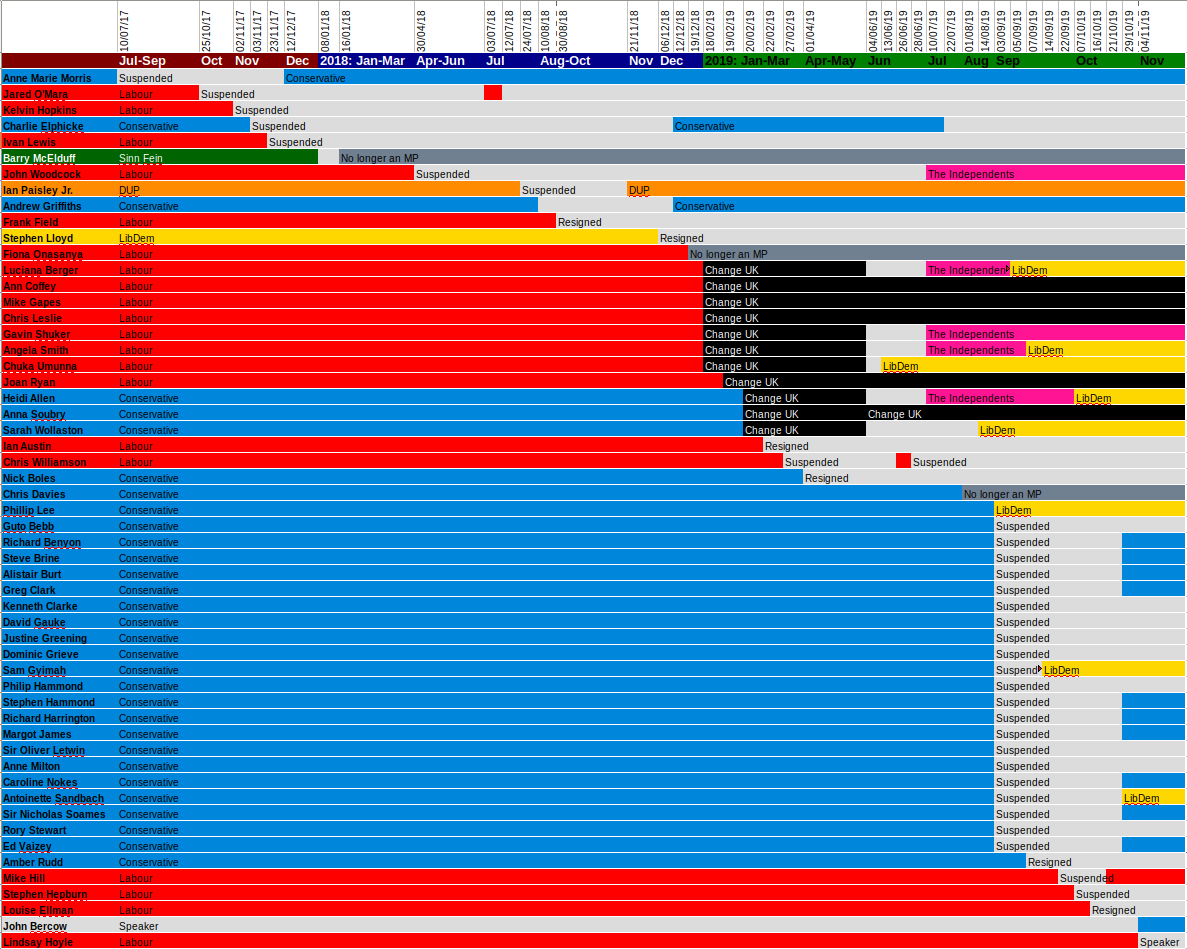
Which MPs changed party affiliation, 2017-2019
Thursday, 6 June 2019
Toxic Online Discussions during the UK European Parliament Election Campaign

The Brexit Party attracted the most engagement on Twitter in the run-up to the UK European Parliament election on May 23rd, their candidates receiving as many tweets as all the other parties combined. Brexit Party leader Nigel Farage was the most interacted-with UK candidate on Twitter, with over twice as many replies as the next most replied-to candidate, Andrew Adonis of the Labour Party.
We studied all tweets sent to or from (or retweets of or by) UK European Election candidates in the month of May, and classified them as abusive or not using the classifier presented here. It must be noted, in particular, that the classifier only identifies reliably whether a reply is abusive or not. It is not sufficiently accurate for us to reliably judge the target politician or party of this abusive reply. What this means is that we can only reliably identify which EP candidates triggered abuse-containing discussion threads on Twitter, but that often this abuse is actually aimed at other politicians or parties.
In addition to attracting the most replies, the Brexit Party candidates also triggered an unusually high level of abuse-containing Twitter discussions. In particular, we found that posts by Farage triggered almost six times as many abuse-containing Twitter threads than the next most replied to candidate, Gavin Esler of Change UK, during May 2019.
There is an important difference, however, in that that many of the abuse-containing replies to posts by Farage and the Brexit Party were actually abusive towards other politicians (most notably the prime minister and the leader of the Labour party) and not Farage himself. In contrast, abusive replies to Gavin Esler were primarily aimed at the politician himself, triggered by his use of the phrase "village idiot" in connection with the Leave Campaign.
Candidates from other parties that triggered unusually high levels of abuse-containing discussions were those from the UK Independence Party, now considered far right, and Change UK, a newly formed but unstable remain party. Change UK was the most active on Twitter, with candidates sending more tweets than other parties. Gavin Esler was the most replied-to Change UK candidate, and also received an unusually high level of abuse. The abuse often referred to his use of the phrase "village idiot" in connection with the leave campaign, which resulted in anger and resentment.
In contrast, MEP candidates from the Conservative and Labour Parties were not hubs of polarised, abuse-containing discussions on Twitter.
What these findings, unsurprisingly, demonstrate is that politicians and parties who themselves use divisive and abusive language, for example, to brand political opponents as “village idiots”, “traitors”, or as “desperate to betray”, are thus triggering the toxic online responses and deep political antagonism that we have witnessed.

MEP candidates from both the Liberal Democrats and the Green Party were also active on Twitter, with the Green MEP candidates second only to Change UK ones for number of tweets sent, but didn't get a lot of engagement in return. The Liberal Democrats in particular received a low number of replies. This may suggest that these parties became the choices of default for a population of discouraged remainers, as both made gains in the election. Both parties attracted a particularly civil tone of reply.
Brexit Party candidates were also the ones that replied most to those who tweeted them, rather than authoring original tweets or retweeting other tweets.
Acknowledgements: Research carried out by Genevieve Gorrell, Mehmet Bakir, and Kalina Bontcheva. This work was partially supported by the European Union under grant agreements No. 654024 SoBigData and No. 825297 WeVerify.
Tuesday, 5 March 2019
Brexit--The Regional Divide
Although the UK voted by a narrow margin in the UK EU membership referendum in 2016 to leave the EU, that outcome failed to capture the diverse feelings held in various regions. It's a curious observation that the UK regions with the most economic dependence on the EU were the regions more likely to vote to leave it. The image below on the right is taken from this article from the Centre for European Reform, and makes the point in a few different ways. This and similar research inspired a current project the GATE team are undertaking with colleagues in the Geography and Journalism departments at Sheffield University, under the leadership of Miguel Kanai and with funding from the British Academy, aiming to understand whether lack of awareness of individual local situation played a role in the referendum outcome.
 Our Brexit tweet corpus contains tweets collected during the run-up to the Brexit referendum, and we've annotated almost half a million accounts for Brexit vote intent with a high accuracy. You can read about that here. So we thought we'd be well positioned to bring some insights. We also annotated user accounts with location: many Twitter users volunteer that information, though there can be a lot of variation on how people describe their location, so that was harder to do accurately. We also used local and national news media corpora from the time of the referendum, in order to contrast national coverage with local issues are around the country.
Using topic modelling and named entity recognition, we were able to look for similarities and differences in the focus of local and national media and Twitter users. The bar chart on the left gets us started, illustrating that foci differ between media. Twitter users give more air time than news media to trade and immigration, whereas local press takes the lead on employment, local politics and agriculture. National press gives more space to terrorism than either Twitter or local news.
On the right is just one of many graphs in which we unpack this on a region-by-region basis (you can find more on the project website). In this choropleth, red indicates that the topic was significantly more discussed in national press than in local press in that area, and green indicates that the topic was significantly more discussed in local press there than in national press. Terrorism and immigration have perhaps been subject to a certain degree of media and propaganda inflation--we talk about this in our Social Informatics paper. Where media focus on locally relevant issues, foci are more grounded, for example in practical topics such as agriculture and employment. We found that across the regions, Twitter remainers showed a closer congruence with local press than Twitter leavers.
 The graph on the right shows the number of times a newspaper was linked on Twitter, contrasted against the percentage of people that said they read that newspaper in the British Election Study. It shows that the dynamics of popularity on Twitter are very different to traditional readership. This highlights a need to understand how the online environment is affecting the news reportage we are exposed to, creating a market for a different kind of material, and a potentially more hostile climate for quality journalism, as discussed by project advisor Prof. Jackie Harrison here. Furthermore, local press are increasingly struggling to survive, so it feels important to highlight their value through this work.
You can see more choropleths on the project website. There's also an extended version here of an article currently under review.


| "People's resistance to propaganda and media‐promoted ideas derives from their close ties in real communities" Jean Seaton |
On the right is just one of many graphs in which we unpack this on a region-by-region basis (you can find more on the project website). In this choropleth, red indicates that the topic was significantly more discussed in national press than in local press in that area, and green indicates that the topic was significantly more discussed in local press there than in national press. Terrorism and immigration have perhaps been subject to a certain degree of media and propaganda inflation--we talk about this in our Social Informatics paper. Where media focus on locally relevant issues, foci are more grounded, for example in practical topics such as agriculture and employment. We found that across the regions, Twitter remainers showed a closer congruence with local press than Twitter leavers.

You can see more choropleths on the project website. There's also an extended version here of an article currently under review.
Tuesday, 11 September 2018
Vizualisations of Political Hate Speech on Twitter
Recently there's been some media interest in our work on abuse toward politicians. We performed an analysis of abusive replies on Twitter sent to MPs and candidates in the months leading up to the 2015 and 2017 UK elections, disaggregated by gender, political party, year, and geographical area, amongst other things. We've posted about this previously, and there's also a more technical publication here. In this post, we wanted to highlight our interactive visualizations of the data, which were created by Mark Greenwood. The thumbnails below give a flavour of them, but click through to access the interactive versions.


Abusive Replies
Sunburst diagrams showing the raw number of abusive replies sent to MPs before the 2015 and 2017 elections. Rather than showing all candidates, these only show the MPs who were elected (i.e. the successful candidates). These nicely show the proportion of abusive replies sent to each party/gender combination but don't give any feeling per MP the proportion of replies which were abusive. Interactive version here!Increase in Abuse
An overlapping bar chart showing how the percentage of abuse received per party/gender by MPs has increased between 2015 and 2017. For each party/gender two bars are drawn. The height of the bar in the party colour represents the percentage of replies which were abusive in 2017. The height of the grey bar (drawn at the back) is the percentage of replies which were abusive in 2015 and the width shows the change in volume of abusive replies (i.e. the width is calculated by dividing the 2015 raw abusive reply count by that from 2017 to give a percentage which is then used to scale the width of the bar). So height shows change in proportion, width shows increase in volume. There is also a simple version of this graph which only shows the change in proportion (i.e. the widths of the two bars are the same). Original version here.Geographical Distribution of Abuse
A map showing the geographical distribution of abusive replies. The map of the UK is divided into the NUTS 1 regions, and each region is coloured based on the percentage of abusive replies sent to MPs who represent that region. Data from both 2015 and 2017 can be displayed to see how the distribution of abuse has changed. Interactive version here!Tuesday, 24 April 2018
Funded PhD Opportunity: Large Scale Analysis of Online Disinformation in Political Debates
Applications are invited for an EPSRC-funded
studentship at The University of Sheffield commencing on 1 October
2018.
The PhD project will examine the intersection
of online political debates and misinformation, through big data
analysis. This research is very timely, because online mis- and
disinformation is
reinforcing the formation of polarised partisan camps, sharing
biased,
self-reinforcing content. This is coupled with the rise in
post-truth politics,
where key arguments are repeated continuously, even when proven
untrue by journalists
or independent experts. Journalists and media have tried to
counter this
through fact-checking initiatives,
but these are currently mostly manual, and thus not scalable to
big data.
The aim is to develop machine learning-based methods for large-scale analysis of online misinformation and its role in political debates on online social platforms.
Application deadline: as soon as possible, until the funding is filled
Interviews: interviews take place within 2-3 weeks of application
Supervisory team: Professor Kalina Bontcheva (Department of Computer Science, University of Sheffield), Professor Piers Robinson (Department of Journalism, University of Sheffield), and Dr. Nikolaos Aletras (Information School, University of Sheffield).
Award Details
The studentship will cover tuition fees at the EU/UK rate and provide an annual maintenance stipend at standard Research Council rates (£14,777 in 2018/19) for 3.5 years.Eligibility
The general eligibility requirements are:- Applicants should normally have studied in a relevant field to a very good standard at MSc level or equivalent experience.
- Applicants should also have a 2.1 in a BSc degree, or equivalent qualification, in a related discipline.
- ESRPC studentships are only available to students from the UK
or European Union. Applications cannot be accepted from
students liable to pay fees at the Overseas rate.
Normally UK students will be eligible for a full award which
pays fees and a maintenance grant if they meet the residency
criteria and EU students will be eligible for a fees-only award,
unless they have been resident in the UK for 3 years immediately
prior to taking up the award.
How to apply
To apply for the studentship, applicants need to apply directly to the University of Sheffield for entrance into the doctoral programme in Computer Science- Complete an application for admission to the standard computer science PhD programme http://www.sheffield.ac.uk/postgraduate/research/apply
- Applications should include a research proposal; CV; academic writing sample; transcripts and two references.
- The research proposal of up to 1,000 words should outline your reasons for applying to this project and how you would approach the research including details of your skills and experience in both computing and/or data journalism.
- Supporting documents should be uploaded to your application.
Saturday, 10 March 2018
Discerning Truth in the Age of Ubiquitous Disinformation (3): The Role of News Media
Discerning Truth in the Age of Ubiquitous Disinformation (3)
The Role of News Media
Post coming soon
Sunday, 23 July 2017
The Tools Behind Our Twitter Abuse Analysis with BuzzFeed
Or...How to Quantify Abuse in Tweets in 5 Working Days
When BuzzFeed approached us with the idea to quantify Twitter abuse towards politicians during the election campaign, we only had five working days, before the article had to be completed and go public.
The goal was to use text analytics and analyse tweets replying to UK politicians, in the run up to the 2017 general election, in order to answer questions such as:
The goal was to use text analytics and analyse tweets replying to UK politicians, in the run up to the 2017 general election, in order to answer questions such as:
- How wide spread is abuse received by politicians?
- Who are the main politicians targeted by such abusive tweets?
- Are there any party or gender differences?
- Do abuse levels stay constant over time or not?
So here I explain first how we collect the data for such studies and then how it gets analysed at scale and fast, all with our GATE-based open-source tools and their GATE Cloud text analytics-as-a-service deployment.
For researchers wishing more in-depth details, please read and cite our paper:
D. Maynard, I. Roberts, M. A. Greenwood, D. Rout and K. Bontcheva. A Framework for Real-time Semantic Social Media Analysis. Web Semantics: Science, Services and Agents on the World Wide Web, 2017 (in press). https://doi.org/10.1016/j.websem.2017.05.002, pre-print
Tweet Collection
We already had all necessary tweets at hand, since, within an hour of #GE2017 being announced, I set up, using the GATE Cloud tweet collection service:
the continuous collection of tweets by MPs, prominent politicians, parties, and candidates, as well as retweets and replies thereof.
I also made a second twitter collector service running in parallel, to collect election related tweets based purely on hashtags and keywords (e.g. #GE2017, vote, election).
I also made a second twitter collector service running in parallel, to collect election related tweets based purely on hashtags and keywords (e.g. #GE2017, vote, election).
How We Analysed and Quantified Abuse
Given the short 5 day deadline, we were pleased to have at hand the large-scale, real-time text analytics tools in GATE, Mimir/Prospector, and GATE Cloud.
The starting point was the real-time text analysis pipeline from the Brexit research last year. That is capable of analysing up to 100 tweets per second (tps), although, in practice, the tweets usually were coming at the much lower 23 tps.
This time, however, we adapted it with a new abuse analysis component, as well as some more up-to-date knowledge about the politicians (including the new prime minister).

The analysis backbone was again GATE's TwitIE system, which consists of a tokenizer, normalizer, part-of-speech tagger, and a named entity recognizer. TwitIE is also available as-a-service on GATE Cloud, for easy integration and use.
Next, we added information about politicians, e.g. their names, gender, party, constituencies, etc. In this way, we could produce aggregate statistics, such as abuse-containing tweets aimed at Labour or Conservative male/female politicians.
Next is a tweet geolocation component, which uses latitude/longitude, region, and user location metadata to geolocate tweets within the UK NUTS2 regions. This is not always possible, since many accounts and tweets lack such information, and this narrow down the sample significantly, should we choose to restrict by geo-location.
We also detect key themes and topics discussed in the tweets (more than one topic/theme can be contained in each tweet). Here we reused the module from the Brexit analyser.
The most exciting part was working with BuzzFeed's journalists to curate a set of abuse nouns typically aimed at people (e.g. twat), racist words, and milder insults (e.g. coward). We decided to differentiate these from general obscene language and swearing, as these were not always targeting the politician. Nevertheless, they were included in the system, to produce a separate set of statistics. We introduced also basic sub-classification by kind (e.g. racial) and strength (e.g. mild, medium, strong), derived from an Ofcom research report on offensive language.
Overall, we kept the processing pipeline as simple and efficient as possible, so it can run at 100 tweets per second even on a pretty basic server.
The analysis results were fed into GATE Mimir, which indexes efficiently tweet text and all our linguistic annotations. Mimir has a powerful programming API for semantic search queries, which we use to drive the various interactive visualisations and to generate the necessary aggregate statistics behind them.
For instance, we used Mimir queries to generate statistics and visualisations, based on time (e.g. most popular hashtags in abuse-containing tweets on 4 Jun); topic (e.g. the most talked about topics in such tweets), or target of the abusive tweet (e.g. the most frequently targeted politicians by party and gender). We could also navigate to the corresponding tweets behind these aggregate statistics, for a more in-depth analysis.
A rich sample of these statistics, associated visualisations, and abusive tweets is available in the BuzzFeed article.
Research carried out by:
Mark A. Greenwood, Ian Roberts, Dominic Rout, and myself, with ideas and other contributions from Diana Maynard and others from the GATE Team.
Any mistakes are my own.
Any mistakes are my own.
Subscribe to:
Comments (Atom)